

One important skill for React users is to be able to create a navigation bar (navbar). You have multiple options for doing so, especially if you pair React with another free and open source CSS framework, such as Bootstrap or Tailwind CSS.
Bootstrap was developed as a framework to provide DRYer code and consistency across internal developer tools. Before this, projects relied on multiple libraries, which could lead to cluttered codebases. Bootstrap contains CSS and, optionally, JavaScript-based design templates for typography, forms, buttons, navigation, and other UI components. Numerous web applications rely on Bootstrap, including Apple Maps Connect.
Tailwind CSS scans HTML files, JavaScript components (and other templates for class names), generates the corresponding styles, and writes them to a static CSS file for easy readability.
In this tutorial, you're going to create a list navbar in React using Bootstrap and Tailwind.
Here’s what you’ll need for this project:
- Some knowledge of CSS
- Some knowledge of React
- npm installed on your local machine
- Head to Bootstrap’s Getting Started page.
1npm install bootstrap
2- Scroll down to Package managers for npm installation since this is a React project.
1npm install react-bootstrap bootstrap@5.1.3
2- Go to the Tailwind CSS documentation.
- Install Tailwind CSS using npm or yarn (check the docs for instructions):
1npm install -D tailwindcss
2- Create a file called
tailwind.config.jsonce the package is installed:
1npx tailwindcss init
2- Configure your template paths. You can check examples in the documentation.
- Add the Tailwind directives to your main CSS file, usually the
index.cssfile. These include the following:
1@tailwind base;
2@tailwind components;
3@tailwind utilities;
4- Start the Tailwind CLI build process:
1npx tailwindcss -i ./src/<your main css file>.css -o ./dist/output.css
2- Wait to receive the
Donemessage in your terminal.
If you prefer, you can follow along with this GitHub repo.
Otherwise, create a React app if you haven’t already. In your terminal, run this:
1npx create-react-app <your app name>
2While you can create your navbar from scratch using the Bootstrap docs, Bootstrap provides a library of free UI components, including navbars with a navbar toggle option. Additionally, you can leverage the power of React hooks or custom hooks to enhance the functionality of the navbar.
- Head to the Getting started section.
- Go to the Navbar section and select a component. Use the Copy button on the top-right corner to copy it.
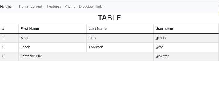
Below is the one used in the repository:
1<nav className="navbar navbar-expand-lg navbar-light bg-light">
2  <a className="navbar-brand" href="#">
3    Navbar
4  </a>
5  <button
6    className="navbar-toggler"
7    type="button"
8    data-toggle="collapse"
9    data-target="#navbarNavDropdown"
10    aria-controls="navbarNavDropdown"
11    aria-expanded="false"
12    aria-label="Toggle navigation"
13  >
14    <span className="navbar-toggler-icon"></span>
15  </button>
16  <div className="collapse navbar-collapse" id="navbarNavDropdown">
17    <ul className="navbar-nav">
18      <li className="nav-item active">
19        <a className="nav-link" href="#">
20          Home <span className="sr-only">(current)</span>
21        </a>
22      </li>
23      <li className="nav-item">
24        <a className="nav-link" href="#">
25          Features
26        </a>
27      </li>
28      <li className="nav-item">
29        <a className="nav-link" href="#">
30          Pricing
31        </a>
32      </li>
33      <li className="nav-item dropdown">
34        <a
35          className="nav-link dropdown-toggle"
36          href="#"
37          id="navbarDropdownMenuLink"
38          data-toggle="dropdown"
39          aria-haspopup="true"
40          aria-expanded="false"
41        >
42          Dropdown link
43        </a>
44        <div className="dropdown-menu" aria-labelledby="navbarDropdownMenuLink">
45          <a className="dropdown-item" href="#">
46            Action
47          </a>
48          <a className="dropdown-item" href="#">
49            Another action
50          </a>
51          <a className="dropdown-item" href="#">
52            Something else here
53          </a>
54        </div>
55      </li>
56    </ul>
57  </div>
58</nav>
59- Go to your React application and create a
src/Navigationfolder. - Create a
src/Navigation/Navbar.jsfile inside thesrc/Navigationdirectory. - Create an empty navbar function in your file:
1import React from "react";
2
3const Navbar = () => {
4    return ()
5}
6export default Navbar
7Paste in the Bootstrap CSS boilerplate navigation menu, as well as the navbar contents you already copied over:
1import React from "react";
2
3const Navbar = () => {
4  return (
5    <nav className="navbar navbar-expand-lg navbar-light bg-light">
6      <a className="navbar-brand" href="#">
7        Navbar
8      </a>
9      <button
10        className="navbar-toggler"
11        type="button"
12        data-toggle="collapse"
13        data-target="#navbarNavDropdown"
14        aria-controls="navbarNavDropdown"
15        aria-expanded="false"
16        aria-label="Toggle navigation"
17      >
18        <span className="navbar-toggler-icon"></span>
19      </button>
20
21      <div className="collapse navbar-collapse" id="navbarNavDropdown">
22        <ul className="navbar-nav">
23          <li className="nav-item active">
24            <a className="nav-link" href="#">
25              Home <span className="sr-only">(current)</span>
26            </a>
27          </li>
28          <li className="nav-item">
29            <a className="nav-link" href="#">
30              Features
31            </a>
32          </li>
33          <li className="nav-item">
34            <a className="nav-link" href="#">
35              Pricing
36            </a>
37          </li>
38          <li className="nav-item dropdown">
39            <a
40              className="nav-link dropdown-toggle"
41              href="#"
42              id="navbarDropdownMenuLink"
43              data-toggle="dropdown"
44              aria-haspopup="true"
45              aria-expanded="false"
46            >
47              Dropdown link
48            </a>
49            <div
50              className="dropdown-menu"
51              aria-labelledby="navbarDropdownMenuLink"
52            >
53              <a className="dropdown-item" href="#">
54                Action
55              </a>
56              <a className="dropdown-item" href="#">
57                Another action
58              </a>
59              <a className="dropdown-item" href="#">
60                Something else here
61              </a>
62            </div>
63          </li>
64        </ul>
65      </div>
66    </nav>
67  );
68};
69
70export default Navbar;
71- Head to your
App.jsand importsrc/Navigation/Navbar.js.
Be sure to also import bootstrap/dist/css/bootstrap.min.css since this code file contains the configuration for Bootstrap React CSS.
1import "bootstrap/dist/css/bootstrap.min.css";
2import Navbar from "./Navigation/Navbar.js";
3
4function App() {
5  return (
6    <div>
7      <Navbar />
8    </div>
9  );
10}
11You’ve now successfully built a navigation bar using Bootstrap.
- Run
npm startto see it in action.
You can also head back to the Bootstrap docs to customize it further.
If you’d rather follow along, check the GitHub repo.
Otherwise, create a React app, if you haven’t already. Go to your terminal and use this command:
1npx create-react-app <your app name>
2While you can create a navbar using the Tailwind CSS docs, Tailwind provides a library of free UI components, including navbars. (There are plenty of other free Tailwind UI component libraries available, including daisyUI).
- Go to Tailwind UI, then to the Navbars section. Pick one navbar, click the HTML button on the top right, and select React from the drop-down menu.
- Find the toggle with an eye (Preview) and two code block arrows (Code) next to the drop-down menu. Switch the toggle to the arrows (Code), and you’ll see the boilerplate code for your Tailwind CSS navbar. Copy it.
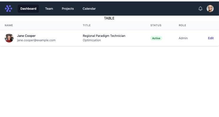
Here’s the one used in the example repository:
1import { Fragment } from "react";
2import { Disclosure, Menu, Transition } from "@headlessui/react";
3import { BellIcon, MenuIcon, XIcon } from "@heroicons/react/outline";
4
5const navigation = [
6  { name: "Dashboard", href: "#", current: true },
7  { name: "Team", href: "#", current: false },
8  { name: "Projects", href: "#", current: false },
9  { name: "Calendar", href: "#", current: false },
10];
11
12function classNames(...classes) {
13  return classes.filter(Boolean).join(" ");
14}
15
16export default function Navbar() {
17  return (
18    <Disclosure as="nav" className="bg-gray-800">
19      {({ open }) => (
20        <>
21          <div className="max-w-7xl mx-auto px-2 sm:px-6 lg:px-8">
22            <div className="relative flex items-center justify-between h-16">
23              <div className="absolute inset-y-0 left-0 flex items-center sm:hidden">
24                {/* Mobile menu button*/}
25                <Disclosure.Button className="inline-flex items-center justify-center p-2 rounded-md text-gray-400 hover:text-white hover:bg-gray-700 focus:outline-none focus:ring-2 focus:ring-inset focus:ring-white">
26                  <span className="sr-only">Open main menu</span>
27                  {open ? (
28                    <XIcon className="block h-6 w-6" aria-hidden="true" />
29                  ) : (
30                    <MenuIcon className="block h-6 w-6" aria-hidden="true" />
31                  )}
32                </Disclosure.Button>
33              </div>
34              <div className="flex-1 flex items-center justify-center sm:items-stretch sm:justify-start">
35                <div className="flex-shrink-0 flex items-center">
36                  <img
37                    className="block lg:hidden h-8 w-auto"
38                    src="https://tailwindui.com/img/logos/workflow-mark-indigo-500.svg"
39                    alt="Workflow"
40                  />
41                  <img
42                    className="hidden lg:block h-8 w-auto"
43                    src="https://tailwindui.com/img/logos/workflow-logo-indigo-500-mark-white-text.svg"
44                    alt="Workflow"
45                  />
46                </div>
47                <div className="hidden sm:block sm:ml-6">
48                  <div className="flex space-x-4">
49                    {navigation.map((item) => (
50                      <a
51                        key={item.name}
52                        href={item.href}
53                        className={classNames(
54                          item.current
55                            ? "bg-gray-900 text-white"
56                            : "text-gray-300 hover:bg-gray-700 hover:text-white",
57                          "px-3 py-2 rounded-md text-sm font-medium"
58                        )}
59                        aria-current={item.current ? "page" : undefined}
60                      >
61                        {item.name}
62                      </a>
63                    ))}
64                  </div>
65                </div>
66              </div>
67              <div className="absolute inset-y-0 right-0 flex items-center pr-2 sm:static sm:inset-auto sm:ml-6 sm:pr-0">
68                <button
69                  type="button"
70                  className="bg-gray-800 p-1 rounded-full text-gray-400 hover:text-white focus:outline-none focus:ring-2 focus:ring-offset-2 focus:ring-offset-gray-800 focus:ring-white"
71                >
72                  <span className="sr-only">View notifications</span>
73                  <BellIcon className="h-6 w-6" aria-hidden="true" />
74                </button>
75
76                {/* Profile dropdown */}
77                <Menu as="div" className="ml-3 relative">
78                  <div>
79                    <Menu.Button className="bg-gray-800 flex text-sm rounded-full focus:outline-none focus:ring-2 focus:ring-offset-2 focus:ring-offset-gray-800 focus:ring-white">
80                      <span className="sr-only">Open user menu</span>
81                      <img
82                        className="h-8 w-8 rounded-full"
83                        src="https://images.unsplash.com/photo-1472099645785-5658abf4ff4e?ixlib=rb-1.2.1&ixid=eyJhcHBfaWQiOjEyMDd9&auto=format&fit=facearea&facepad=2&w=256&h=256&q=80"
84                        alt=""
85                      />
86                    </Menu.Button>
87                  </div>
88                  <Transition
89                    as={Fragment}
90                    enter="transition ease-out duration-100"
91                    enterFrom="transform opacity-0 scale-95"
92                    enterTo="transform opacity-100 scale-100"
93                    leave="transition ease-in duration-75"
94                    leaveFrom="transform opacity-100 scale-100"
95                    leaveTo="transform opacity-0 scale-95"
96                  >
97                    <Menu.Items className="origin-top-right absolute right-0 mt-2 w-48 rounded-md shadow-lg py-1 bg-white ring-1 ring-black ring-opacity-5 focus:outline-none">
98                      <Menu.Item>
99                        {({ active }) => (
100                          <a
101                            href="#"
102                            className={classNames(
103                              active ? "bg-gray-100" : "",
104                              "block px-4 py-2 text-sm text-gray-700"
105                            )}
106                          >
107                            Your Profile
108                          </a>
109                        )}
110                      </Menu.Item>
111                      <Menu.Item>
112                        {({ active }) => (
113                          <a
114                            href="#"
115                            className={classNames(
116                              active ? "bg-gray-100" : "",
117                              "block px-4 py-2 text-sm text-gray-700"
118                            )}
119                          >
120                            Settings
121                          </a>
122                        )}
123                      </Menu.Item>
124                      <Menu.Item>
125                        {({ active }) => (
126                          <a
127                            href="#"
128                            className={classNames(
129                              active ? "bg-gray-100" : "",
130                              "block px-4 py-2 text-sm text-gray-700"
131                            )}
132                          >
133                            Sign out
134                          </a>
135                        )}
136                      </Menu.Item>
137                    </Menu.Items>
138                  </Transition>
139                </Menu>
140              </div>
141            </div>
142          </div>
143
144          <Disclosure.Panel className="sm:hidden">
145            <div className="px-2 pt-2 pb-3 space-y-1">
146              {navigation.map((item) => (
147                <Disclosure.Button
148                  key={item.name}
149                  as="a"
150                  href={item.href}
151                  className={classNames(
152                    item.current
153                      ? "bg-gray-900 text-white"
154                      : "text-gray-300 hover:bg-gray-700 hover:text-white",
155                    "block px-3 py-2 rounded-md text-base font-medium"
156                  )}
157                  aria-current={item.current ? "page" : undefined}
158                >
159                  {item.name}
160                </Disclosure.Button>
161              ))}
162            </div>
163          </Disclosure.Panel>
164        </>
165      )}
166    </Disclosure>
167  );
168}
169- Go to your React application and create a
src/Navigationfolder. - Create a
src/Navigation/Navbar.jsfile in thesrc/Navigationdirectory. - Paste the Tailwind CSS boilerplate navigation menu and the navigation menu you copied over before in your file. Look for other Tailwind imports at the top of the file and install their packages accordingly. The function name may be something generic, like
Example, but rename it to something more specific, likeNavbar. - Go to your
App.jsand importsrc/Navigation/Navbar.js.
Be sure to also import index.css since it contains the configuration for Tailwind CSS:
1import "./index.css";
2import Navbar from "./Navigation/Navbar.js";
3
4function App() {
5  return;
6  <div>
7    <Navbar />
8  </div>;
9}
10
11export default App;
12- Run
npm start. Your navbar should look like this:
- Check the Tailwind CSS docs if you want to customize it further. You can add elements into a CSS class in-line to your tag’s
classNameor, for example, add colors to yourtailwind.config.jsfile.
You've now seen two easy ways to create a navbar in your React app. Bootstrap and Tailwind CSS are both excellent choices for quickly styling an application while allowing for more personalization.
The free components are great for quick-start applications, but be sure to check each framework's documentation and libraries to see how you can use props effectively to enhance the functionality and appearance of your navbar contents
If you’re looking to ship your project faster or if you are building on a larger scale, you might want to check us (Retool) out. We provide a complete set of building blocks straight out of the box. You can assemble an app in minutes by dragging and dropping from Retool's pre-built components and quickly connect to backend databases and APIs. We think that Retool is great for building internal tools, admin panels, and CRUD interfaces so you can quickly automate the manual and tedious tasks saving you time for those more bespoke React projects. For more info, check out the docs.
