
We recently unveiled some major updates to the core Retool editor to improve its learnability and ergonomics. As Retool's capabilities have grown, so have the complexities of starting and scaling on the platform. We set out to make the system easier to grasp for new users while improving speed and efficiency for experienced developers.
Striking a balance between the unique needs of these two user groups while implementing foundational changes to a tool deeply ingrained in daily workflows presented fascinating challenges. In this post, we’ll take you behind the scenes, sharing how we brought big changes to life and overcame common obstacles to building large-scope projects.
The IDE redesign project began with a question faced by many teams building rapidly growing platforms: How can we ensure the product experience is unified as our offering expands? As we explored possible solutions, ideas seemed to trend towards transforming Retool from a fragmented experience, where each product looked and functioned differently, to an integrated development environment (IDE)—a flexible foundation that would link all the elements of the platform together into a cohesive entity. Pursuing this meant making some foundational changes to the core editor.
In order to do that, we needed our EPD teams to tackle the problem collectively. As we kicked off this project, my colleague Gadzhi and I presented a North Star vision that reimagined what the existing customer journey could look like. By focusing on this aspirational future state rather than immediate tactical solutions, we aimed to spark curiosity in the team and encourage open discussion about the trade-offs associated with various approaches. This visioning exercise not only gave us a shared perspective on the possible, but inspired the team to explore possibilities and directions we could pursue to get there.
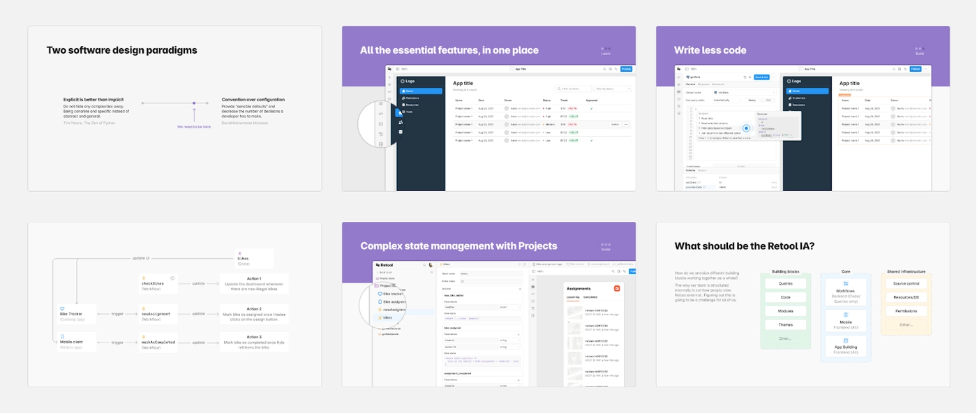
The objective of creating a “North Star” is not to provide answers, but to illuminate the path toward creative solutions. We saw the North Star as something of a toolkit to help the team understand the problem and spark fresh ideas. We created a future-looking presentation that transformed our abstractions into concrete visuals with clear examples of the customer journey. This presentation brought in valuable feedback from the team—feedback that helped us prioritize which improvements we’d make to the core editor first.
Often, grand ideas can falter in the early phases due to lack of buy-in and momentum—it can be hard to get things moving when the paths forward are unmarked and boundless. To generate traction, we broke down the North Star into smaller, verifiable milestones and constantly connected the project vision back to customer problems.
Prioritization played a key role in this approach. We divided the vision into several stages, giving precedence to initiatives with manageable scope but high impact. We recognized that we couldn’t immediately solve all the problems addressed by our ambitious vision—but we could get the project moving with a small three-person team of a PM, a designer, and an engineer.
Often, grand ideas can falter in the early phases due to lack of buy-in and momentum—it can be hard to get things moving when the paths forward are unmarked and boundless.
We decided to first focus on improvements to the core building experience. This allowed us to build confidence incrementally and gave us more time for design explorations around the more ambiguous questions of scalability, extensibility, and unification.
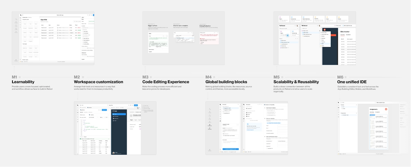
To connect the vision back to customer problems, we dove into usage data, uncovering common patterns and workarounds. We also observed how customers were building in Retool, and worked to identify inefficiencies in existing development workflows. Notably, the core editor had become increasingly unwieldy over the years as we kept adding more features, leaving the UI cluttered and the layout less than optimally organized. After hearing customers regularly highlight the interface's lack of customizability, we gained confidence that we were going down the right path.
The initial design phase of this project revolved around addressing overarching conceptual questions. Instead of merely repositioning elements in the editor, we wanted to define fundamental principles for information architecture (IA) and interaction patterns. This involved a lot of pattern matching, identifying which aspects of the problem had been solved by other products and which were truly distinctive and unique for Retool. Establishing these early distinctions and constraints laid the groundwork for evaluating trade-offs during the decision-making process.
The first design challenge we faced was the inherent tension between two key objectives: learnability and customizability. As we simplified the system to enhance learnability, we recognized that we could also find ourselves constrained in our ability to offer the deep customization sought by our users. This type of tension is a fairly common dilemma in professional tools—even in complex, modular IDEs like VSCode or IntelliJ, constraints and rules are in place to make sure the systems are easy to learn.
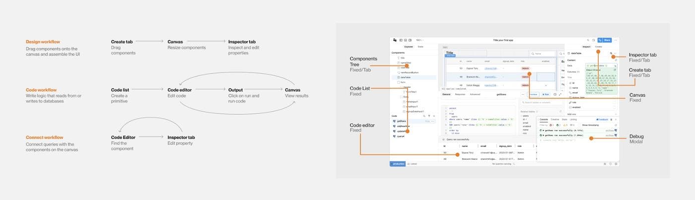
The second challenge came from the interconnectedness of various developer workflows, a unique aspect of working in Retool. There's no fixed, step-by-step building process. Users can start from components or code and frequently switch between designing UI, writing logic, and connecting UI to queries. Unlike traditional IDEs, Retool doesn’t rely on a singular file system with inputs and outputs. Instead it has a logic layer and a canvas that can be directly manipulated, creating a tight connection between code and design. As a result, Retool developers often need to see everything at once to quickly build their apps, and we cannot simply tuck away information to make things less overwhelming.
For us, early framing of constraints wasn't just about gaining a deeper understanding of the problem; it was also about building a solid framework for making future product decisions. It's like creating a multi-dimensional chart that lets you visualize and weigh the trade-offs for each option.
When exploring divergent ideas, we found that it helps to try a couple of methods. Sometimes it’s advantageous to go broad and explore multiple directions, but when you’re working with a wide range of possibilities, it can help to narrow it down and explore two extremes.
We decided to try this approach when evaluating what the high-level structure and content area interaction should be in the new IDE. Along the way, we measured our ideas against the two constraints we defined earlier: balancing learnability and customizability, and supporting interconnected workflows.
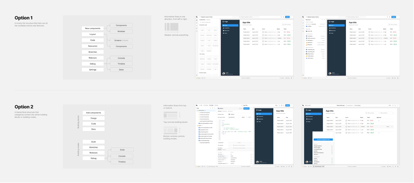
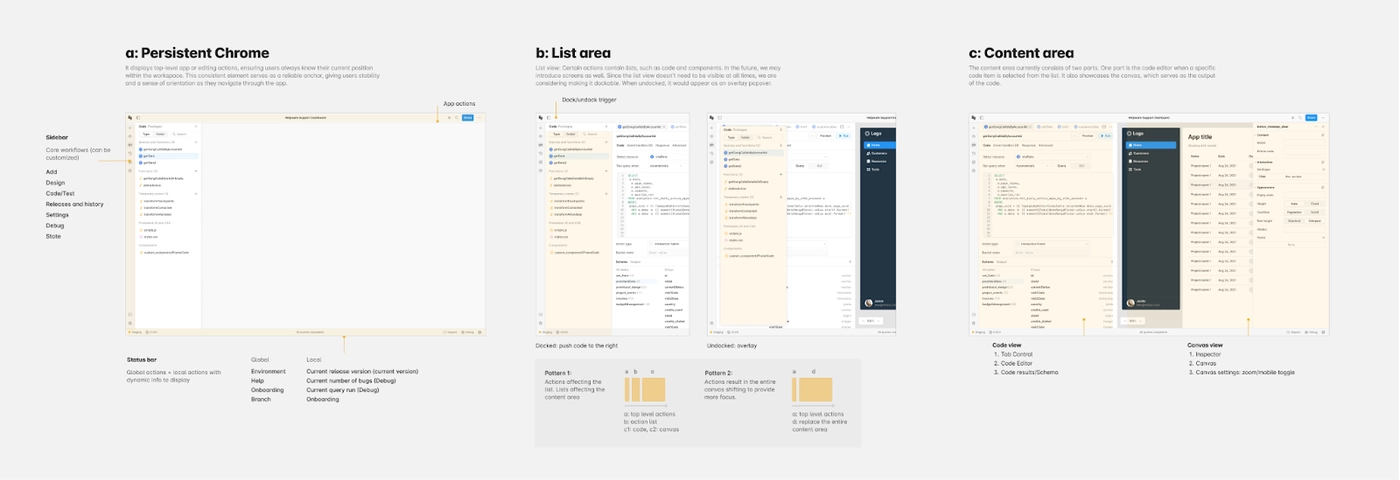
Starting with the high-level IA, we found there were numerous ways to structure and arrange the content and actions. We narrowed our options to two distinct paths:
- A flat structure that lists out all the available workflows and actions. Visually, this can be a simple sidebar. Information flows in one direction, from left to right.
- A hierarchical structure that categorizes workflows and actions into different groups. Visually, this can be a “mode switcher.” Core workflows open with triggers in the header, while additional workflows are accessible through the bottom status bar.
Ultimately we leaned towards the flat structure. It’s challenging to divide the IDE into modes because workflows in Retool are so interconnected that the same features are often needed in multiple modes. Rather than dictating what users need for each workflow, we wanted to retain the flexibility for people to customize their workspace.
Next, we applied this method to finding the right level of customization for the content area. Previously, users were confined to a fixed layout with all the information crammed into one view. With the new IDE, we wanted to cater to various use cases, be it focusing on a single workflow or performing multiple workflows simultaneously. To tackle this, we also explored two divergent directions:
- Tab-based view: Treat the canvas on the same level as other code files, allowing users to rearrange elements freely through drag and drop.
- Split view: Content area is divided into two areas, code and design. Canvas is treated as a special unit. The layout is customizable but confined to a few options.
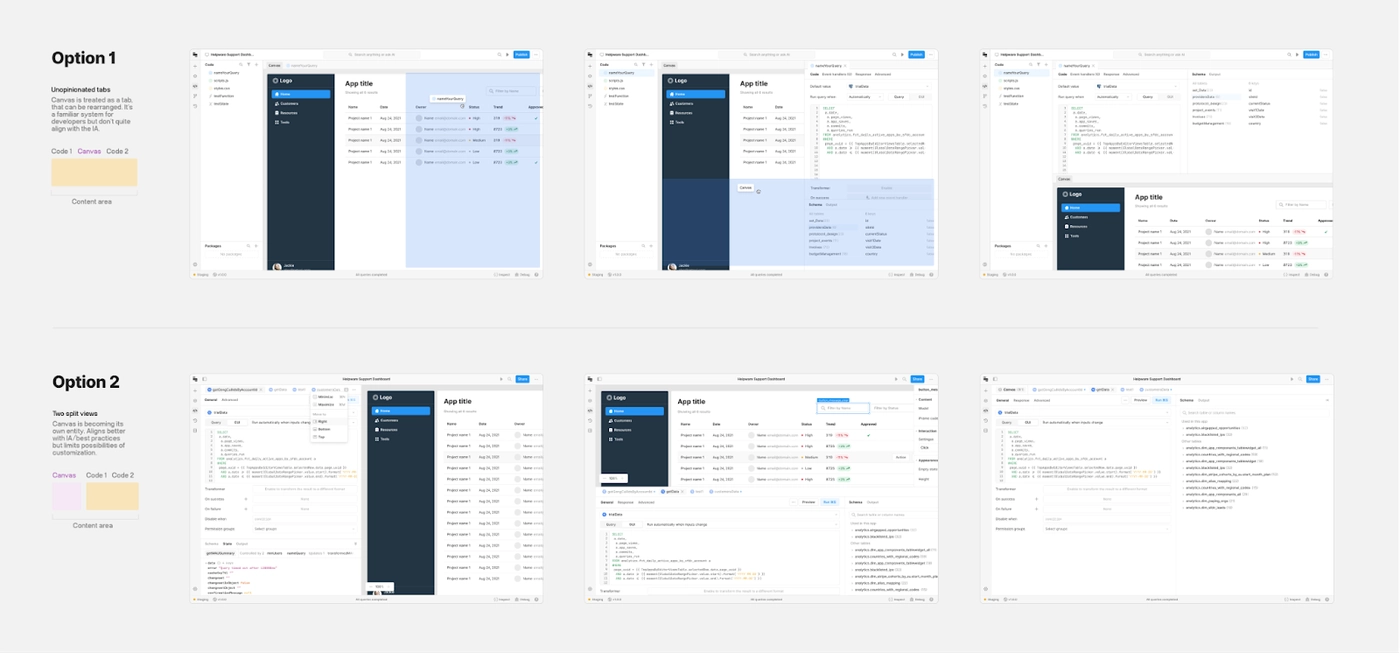
While the first option aligns well with conventional IDE behaviors, the second option is a more opinionated approach that provides an efficient default layout and helps new users establish a faster connection between code and canvas.
Exploring extremes enabled us to figure out which direction we most aligned with before spending time refining the approach. Instead of debating the details, we began building with a clear sense of where to start first.
Ideas can be difficult to validate in static Figma mocks, so we decided to discover and address problems by actually building our ideas. Throughout the project, our engineering team created working versions of the IDE that we presented to both internal and external users to gather feedback.
For example, when exploring the new IA structure, we presented an early version to brand new users to determine if they could quickly grasp Retool’s mental model when the content is divided into different tabs. Similarly, for the interaction pattern, we launched a basic version internally to discover if a limited set of customizations would be sufficient to meet most builders' needs. The insights gained from gathering early user feedback and dogfooding these rough versions helped us make incremental improvements and address previously unnoticed problems.
The insights gained from gathering early user feedback and dogfooding these rough versions helped us make incremental improvements and address previously unnoticed problems.
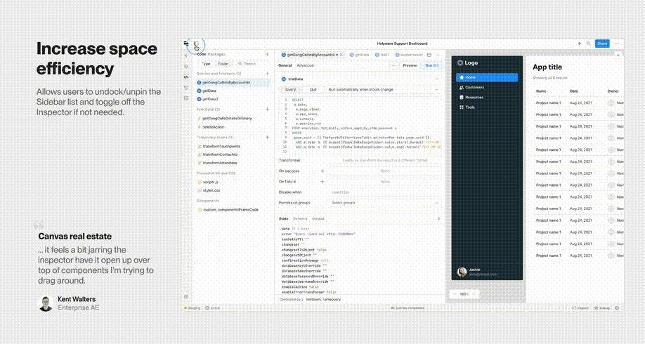
Further down the line, we repeated this process by casting a wider net with a beta program. When users downgraded, we explicitly asked for a reason why, enabling the beta to capture valuable feedback and allowing both design and engineering to respond practically in real time. In many of these cases, we leveraged what we had already built to solve for customer frustrations. For example, we removed the State tab when introducing the Sidebar, and users downgraded since they could no longer easily inspect and debug their app state. Design worked to reclaim that space in the IDE while engineering leveraged the Sidebar we had just built to house our Debug Tools in the bottom left. Similarly, we leveraged the unpinning functionality of the Sidebar and applied the same pattern to the Inspector—giving space back to the canvas on smaller screens.
Building in this iterative manner comes with its own challenges as well. But we found some effective ways to tackle them:
- Create a team culture that embraces the idea that all work done is valuable—even if it doesn't make the final cut. We experimented with making the Inspector panel visible only when a component is selected, but soon realized it felt jarring and didn’t align with the existing canvas constraints. With the mindset that the work we put into the experiment wasn’t wasted—it helped us find a better path, after all—we were able to document our learnings and redirect time and energy towards more effective solutions.
- Clearly communicate internally what exactly you’re testing and what is remaining work. This ensures that feedback remains actionable and coherent, especially when not everything is fully functional yet.
- Be methodical about parsing customer feedback—rather than responding impulsively. This might be the most difficult challenge of all. We leveraged a framework that prompts us to consider whether feedback represents a common theme or a personal preference and what potential chain effects or dependencies it may entail.
The best products are often built through constant iteration and small, thoughtful tweaks. This holds particularly true for open-ended projects like the IDE, where every change contributes to the foundation for the future. We’re excited by where we’ve landed, but there are still a lot of unknowns and open questions. Will the foundation withstand the increasing complexity of the product? How will our IA and interaction philosophy translate to other tools on our platform? In the coming weeks and months, we’ll continue to explore these questions in order to refine the design and add new features.
Moreover, taking on a project like this provides the team with a robust decision-making framework to continue to grow, expand, and even break the system. In this project, we’ve taken the time to document the principles guiding our work, past experiments that we explored, and decisions that warrant reevaluation. For example, while our current IA maintains a relatively flat structure, we anticipate certain workflows may demand exceptions, requiring more screen real estate and focus. Similarly, for the interaction patterns, even though we adopted an opinionated approach to start, we may want to slowly increase the customizability so the surface can morph into anything, regardless of what people are building.
Taking on a project like this provides the team with a robust decision-making framework to continue to grow, expand, and even break the system.
With a decision-making framework in place and robust documentation, the team doesn’t face a strict set of “right” or “wrong” answers to pick from—instead, they’re equipped with the context they need to expand on the system and test its boundaries effectively.
The work of building software is never truly “done.” We’re excited to get your feedback on the new IDE to continue making it the best it can be—hop into an app to give it a try, and share your thoughts with us. We’re excited to hear how you build!
This project would not have been possible without our small but mighty IDE team: Joshua Tang, Will Su, Darya Verzhbinsky, Tiago Ferreira, Jennifer Zhang, and Jessica Sun. Special thanks to the Design and Content teams for all the support and guidance throughout the project, as well as the help on this blog post: Amanda Bell, Ben Huggins, Si Min Lee, Kyle Turman, Gadzhi Kharkharov, Andrew Shen, Ryan Lucas, and Sid Orlando.